# QNV — Making real-time transport information easier to understand
**Role:** Senior Graphic Designer / UI/UX Designer
**Focus:** Product Design · UX/UI · Visual Systems
**Duration:** 4 months
**Team:** Project Lead · 3 Developers · QA Engineer · Security Specialist · Designer
This project was created in collaboration with the team at [RAIOK], where I worked as part of the design team throughout the project.
## Overview
QNV is a German public transport company serving several regions and connecting passengers through an extensive bus network.
Together with a cross-functional team, we designed QNV’s digital service with the goal of making complex transport information easier to understand and access.
My role combined product thinking, UX/UI design and visual design. I was responsible for translating business and technical requirements into clear user flows, defining interface logic and creating a consistent visual system across digital and physical touchpoints.
## The problem
Public transport information changes constantly.
Roadworks, accidents, temporary route changes and other disruptions can affect multiple areas at the same time. For passengers, the important question is not simply *what happened*, but:
**Does this affect my route, my area or my trip right now?**
A large amount of constantly changing information is difficult to communicate through traditional lists and static pages alone.
The challenge was to create an interface capable of presenting dynamic transport data while remaining clear and understandable at a glance.
## Product challenge
One of the central product challenges was information hierarchy.
The service needed to support different user needs and different levels of detail:
* users quickly checking what is happening in their local area;
* passengers searching for a specific disruption;
* users comparing several events;
* people planning their trip for a particular date;
* users looking for schedules, tickets or general transport information.
The interface therefore needed to work both as a quick overview and as a detailed information tool.
## Core experience — Interactive transport map
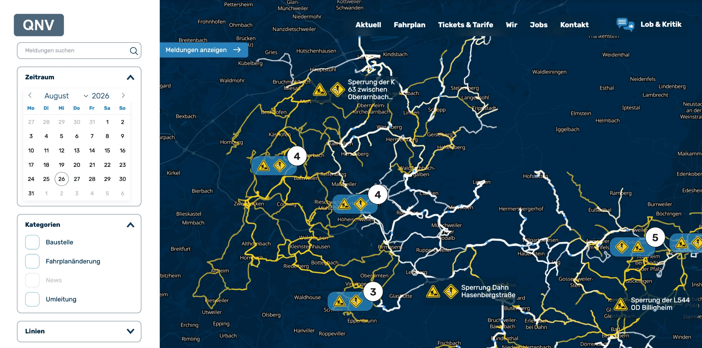
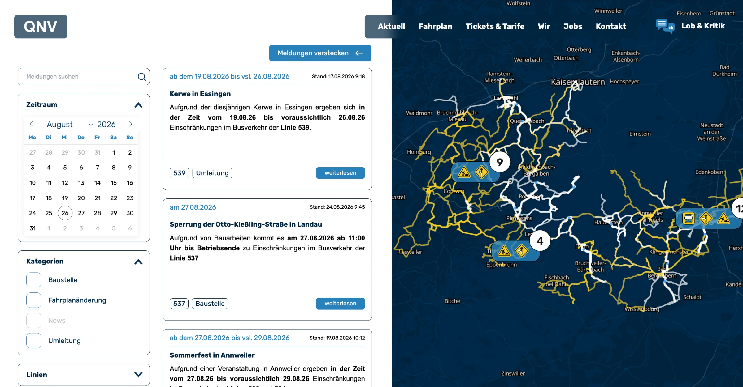
The key feature of the product became an **interactive live map** showing current events across the transport network.
Instead of scanning long lists of updates, users can immediately see what is happening in different areas and understand events in their geographic context.
The map displays roadworks, accidents, temporary route changes, disruptions and other transport-related events across roads and regions.
My task was to design a system that could keep this information readable and useful even when many events were happening simultaneously.
## UX decisions
### Geographic context
Instead of separating transport updates from their location, events are displayed directly on the map.
This allows users to immediately understand the relationship between an incident, the surrounding roads, nearby areas and the transport network.
### Event categories
Different types of events use a consistent system of visual markers and icons.
This makes it possible to recognise the type of disruption before opening detailed information and creates a faster visual scanning experience.
### Filtering
Users can filter events by category and time period.
The goal was to reduce information overload and allow people to focus on the information relevant to their current task or planned journey.
### Clustering
When several events appear close to one another, they are grouped into clusters.
As users zoom into the map, more detailed information becomes available.
This approach keeps the regional overview readable without hiding the complexity of the underlying data.
### Information hierarchy
I worked on balancing three layers of information:
**overview → event type → detailed information**
The interface communicates the most important information first while allowing users to progressively explore additional detail when needed.
## Beyond the map
The product was not limited to the interactive map.
We also designed the wider QNV website ecosystem, including:
* current transport information;
* schedules;
* tickets and fares;
* company information;
* jobs;
* passenger communication and feedback.
My responsibility was to keep these different areas of the service visually and structurally consistent while working with different types and levels of information.
## Working with a cross-functional team
The project was developed over approximately four months by a cross-functional team consisting of a project lead, three developers, a QA engineer, a security specialist and myself as the designer.
I worked closely with developers throughout the project, adapting design decisions to technical constraints and defining how complex map interactions, data-driven components and different interface states should behave in the final product.
Collaboration with QA and security also meant considering the experience beyond static screens — including edge cases, system behaviour, technical requirements and real-world usage scenarios.
## Visual system
Alongside the UX/UI work, I developed the visual direction for the service.
The objective was not only to create a recognisable interface but to establish a visual language that could scale across multiple touchpoints.
The system covered typography, colours, interface components, icons and graphic principles used throughout the digital product.
## From digital product to physical environment
The visual system was also extended beyond the website.
I designed graphics for **QNV vehicles** and created a compact **design guide** defining the core principles of the brand’s visual language.
This helped connect the digital service with QNV’s physical transport environment and maintain a consistent identity across different user touchpoints.
## Outcome
Over four months, our team created a connected digital transport experience centred around an interactive live map that transforms complex, constantly changing operational data into clear and accessible information.
The result brings together **product design, UX/UI, information architecture, data visualisation and visual identity** within one coherent system — turning real-time transport information into an experience that remains understandable and useful in everyday situations.